Industrial IoT &
Operational Intelligence
Transforming a cluttered industrial monitoring system into an intuitive, dark-mode experience for global manufacturing operations.
Global OEE
87.3%
Plants
247
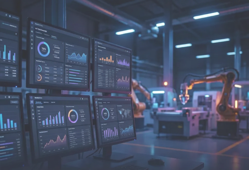
The Existing System
A cluttered, difficult-to-navigate interface that left users struggling to connect high-level data with machine-specific details
Low Visibility
Light mode made status colors (Red/Green) hard to read on bright factory floors.
Navigation Trap
Users couldn't easily move back up the hierarchy, getting lost in nested views.
Disconnected Data
3D visualizations had no clear connection to performance metrics and charts.
Redesigning for Global Scale
The client had a manufacturing monitoring system that captured global data, but the interface was cluttered and difficult to navigate. Users struggled to move between high-level maps and specific machine details without getting lost.
Role
Lead UX Designer
Tools & Methods
Heuristic Evaluation, Persona Development, Information Architecture, Figma, FigJam
Deliverables
UI Audit, Information Architecture, High-Fidelity Prototypes
My Goal
Redesign the experience to improve visibility, navigation, and readability for factory operators and executives.
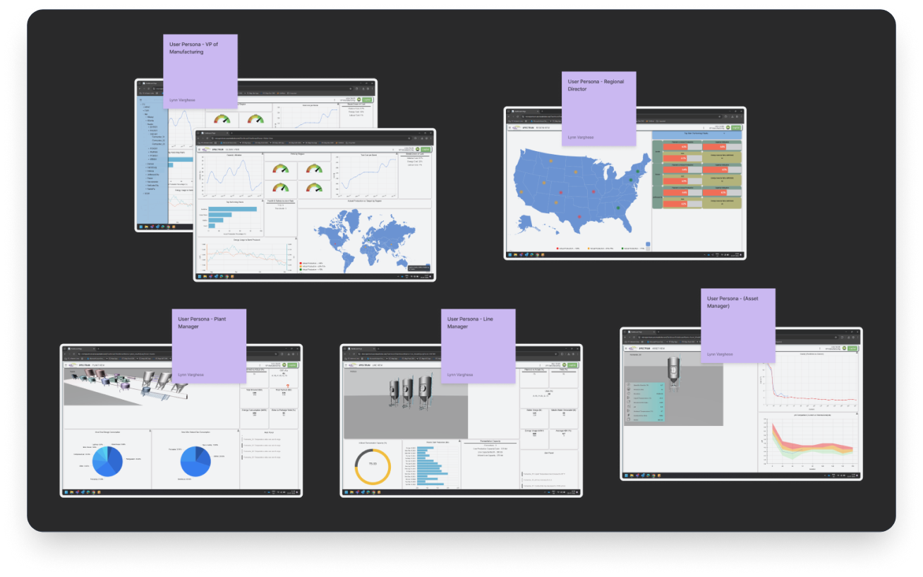
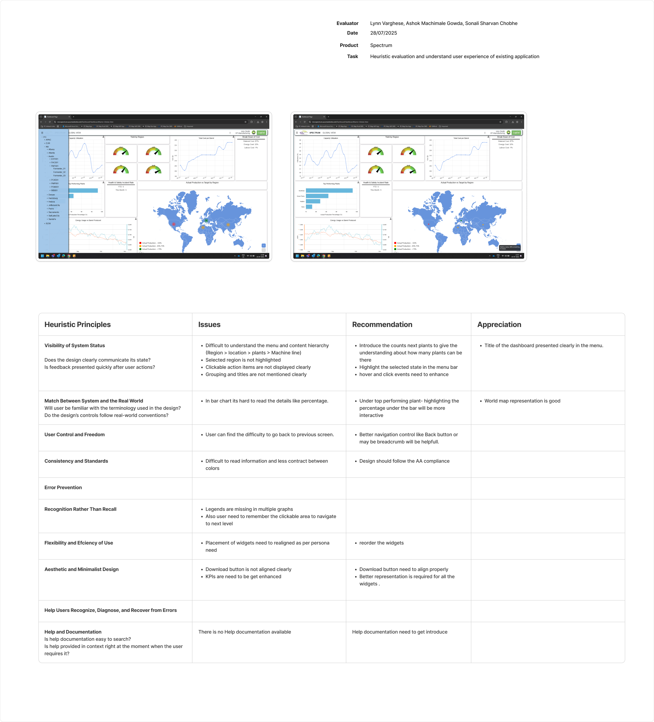
Heuristic Evaluation
Rigorous analysis using Nielsen's 10 Principles across multiple user personas
VP of Manufacturing
Regional Director
Plant Manager
Line Manager
Quality Manager
Key Findings
Navigation Trap
Users couldn't go "back" up the hierarchy easily, getting lost in nested views
Low Visibility
Light mode made it hard to read status colors (Red/Green) on factory floors
Mystery Meat Nav
Clickable areas in the 3D view weren't obvious, causing confusion
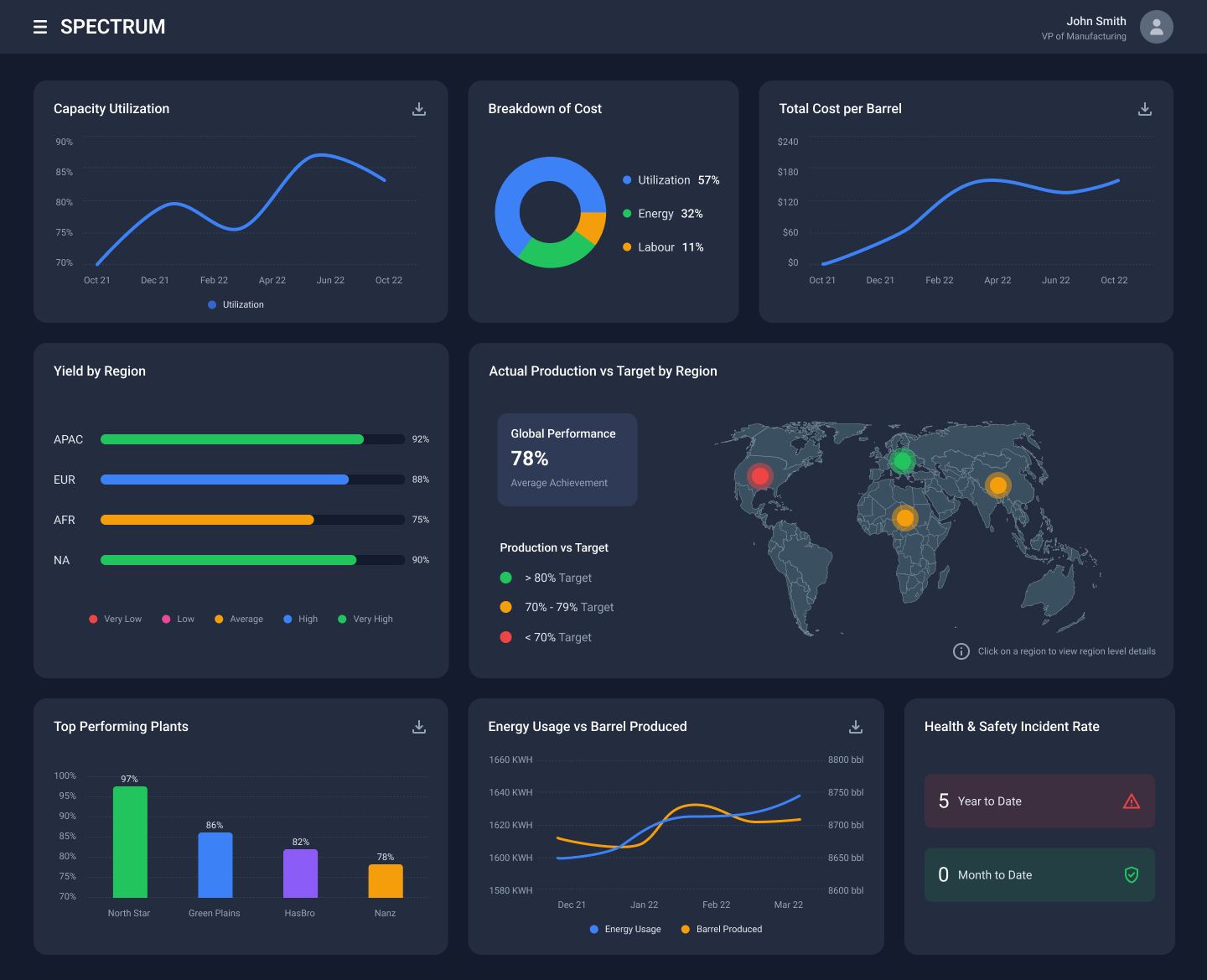
The Redesigned Experience
A scalable, intuitive dashboard with dark mode, integrated visualizations, and seamless navigation
VP of Manufacturing
Global overview dashboard with high-contrast dark mode, organized card layouts showing KPIs, regional breakdowns, and plant performance at a glance.
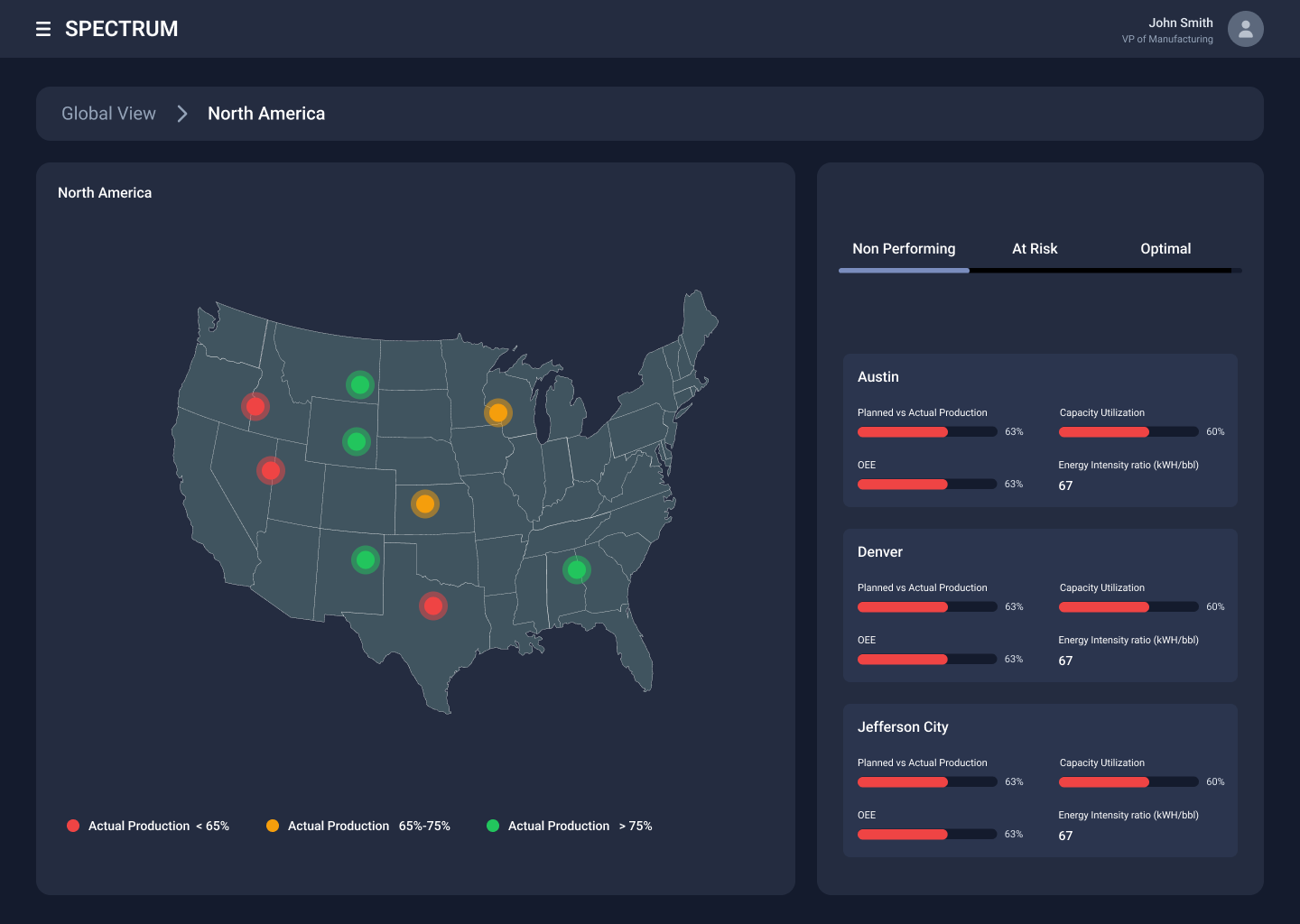
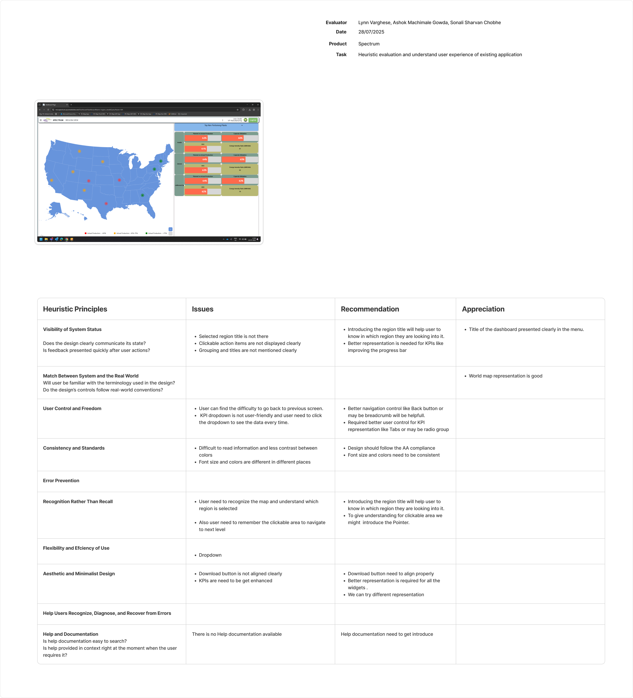
Regional Director
Interactive US map with color-coded plant status (red/yellow/green), tabbed performance filters, and detailed metrics for Austin, Denver, and Jefferson City plants.
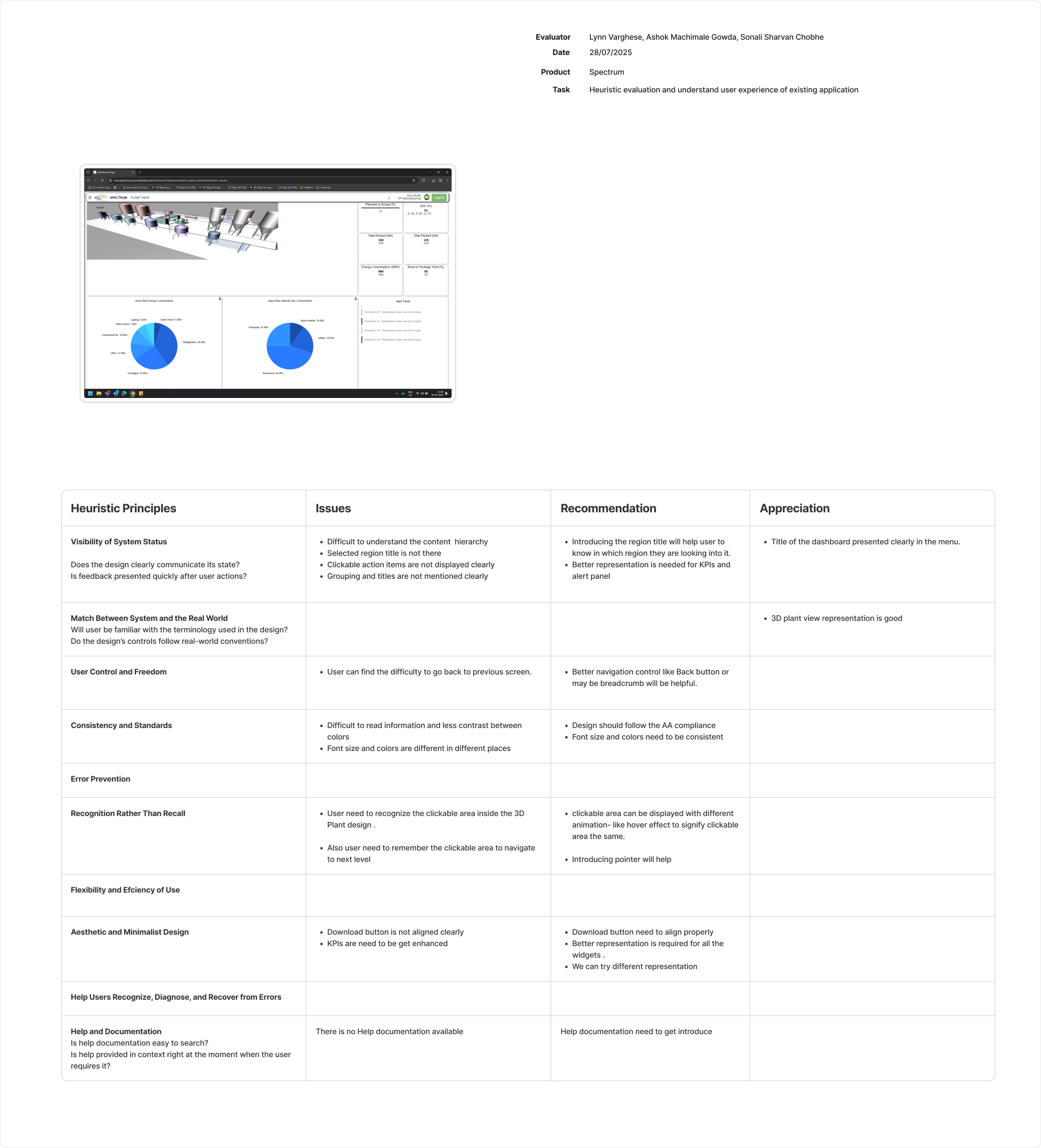
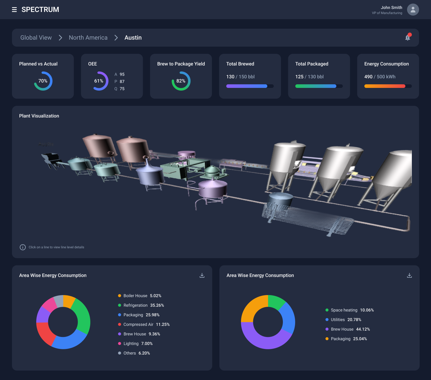
Plant Manager
Austin plant with isometric 3D facility layout, integrated KPIs showing OEE and production metrics, plus area-wise energy consumption bar charts.
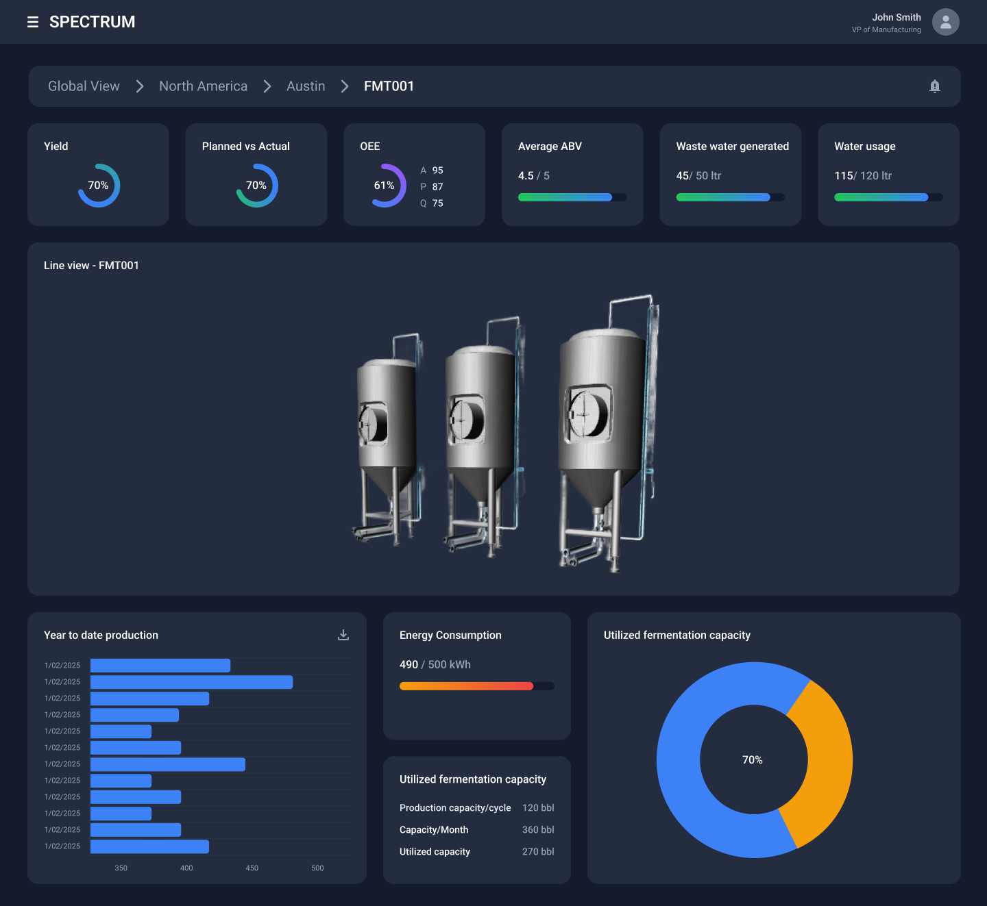
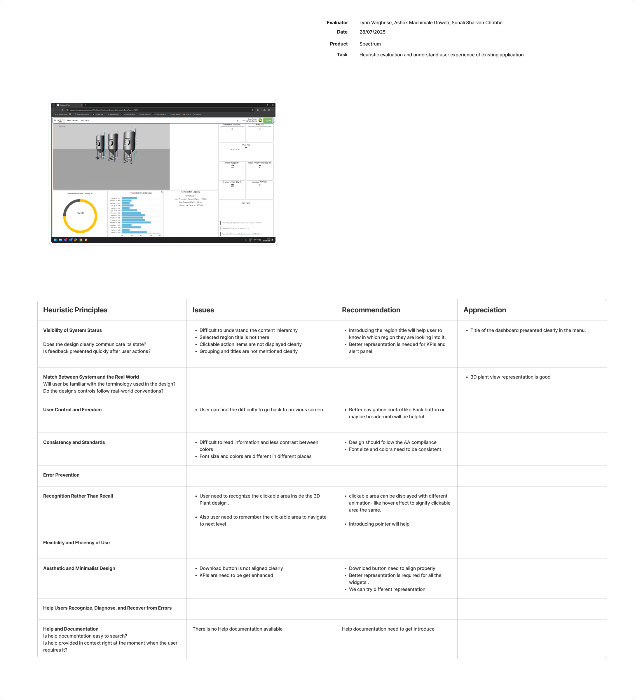
Line Manager
Fermentation line (FMT001) displaying multiple 3D tank assets with individual status indicators, current batch information, and consolidated performance data.
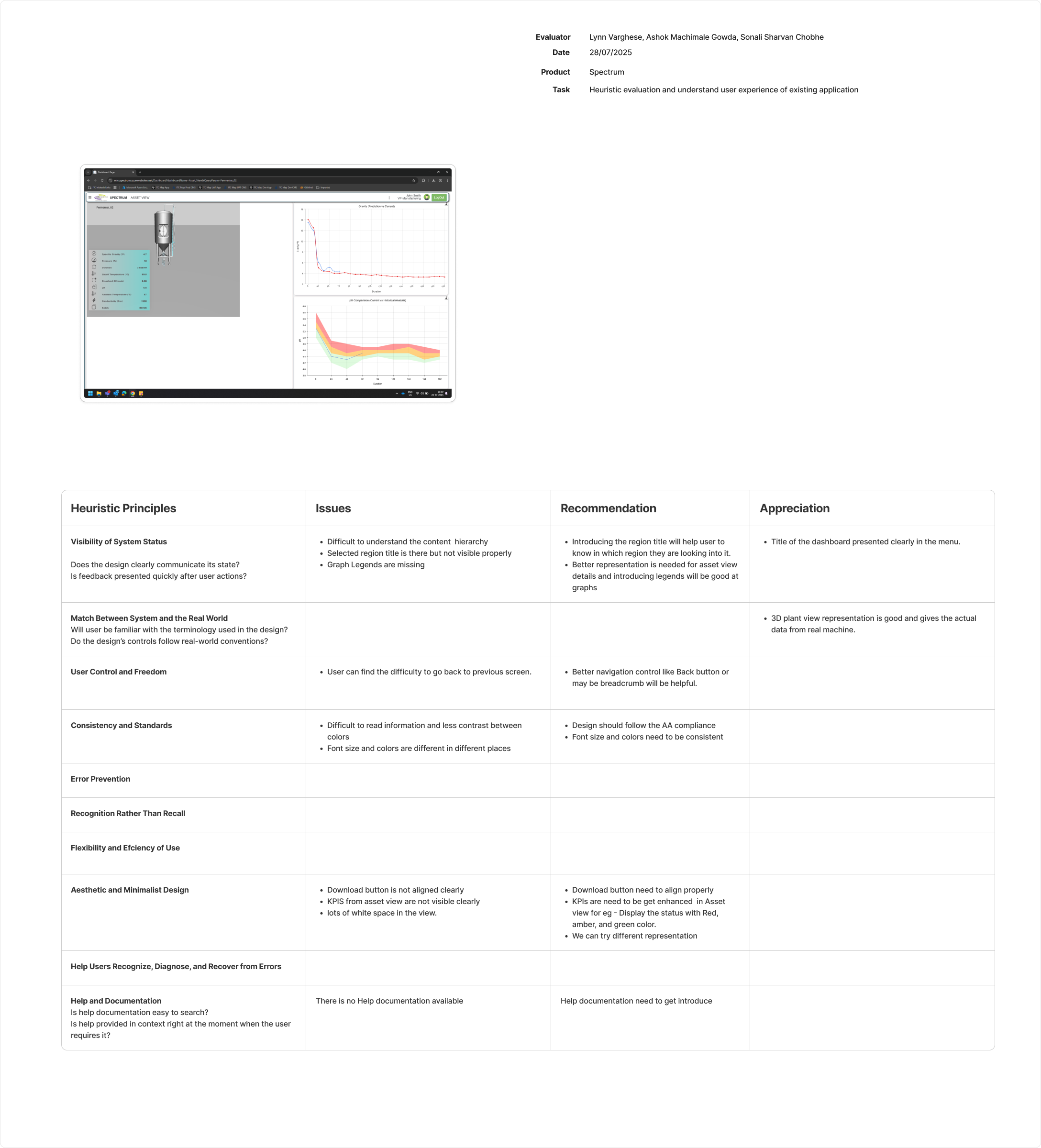
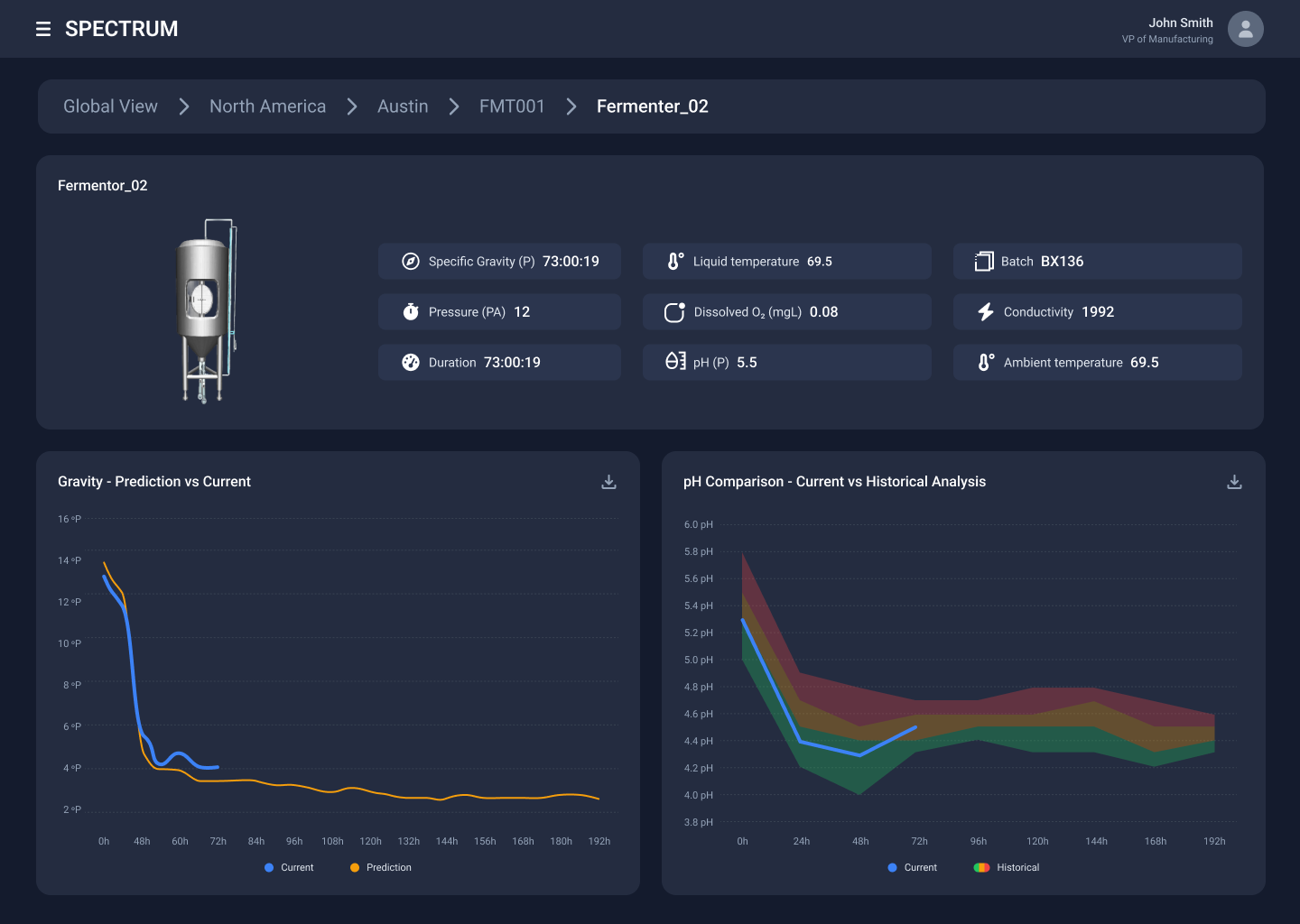
Asset Manager
Individual fermenter (Fermenter_02) with detailed 3D digital twin, real-time temperature and pressure parameters, and historical trend comparison charts.
Impact & Conclusion
By grounding the redesigned MVP into a scalable, intuitive tool
Clear Navigation
Breadcrumb system eliminated user confusion
High Visibility
Dark mode improved readability
Faster Decisions
Reduced diagnostic time
Scalable System
Supports global expansion
The new design significantly reduced the cognitive load for operators managing complex industrial assets across a global manufacturing network.